After reading a post on website stickiness over at ProBlogger, I spent a good amount of time this past weekend implementing Darren’s tips, in order to make this blog more inviting to readers.
As I uploaded plugin after plugin, and asked my husband to make design tweak after design tweak (I may be his most demanding customer), it occurred to me that a first impression post was in order.
After all, despite our having the ability to wear bunny slippers and fuzzy pants for the bulk of the day, first impressions with prospective clients still count for a lot.
So…what did I learn from the changes I implemented?
It’s not just what’s on the inside that counts.
This may seem snotty but, when looking for a bed & breakfast the other month, I automatically disqualified all b&bs with an ugly web site. Why? With the number if b&bs out there, I had to minimize my search field somehow!
Most of us suffer the same problem within our field of choice. With so many fabulous freelancers to choose from, it’s difficult for any one of us to stand out from the pack. Prospective clients are usually looking for any reason at all to eliminate us from their list of possible hires.
Make a good first impression by projecting professionalism. If you have a web presence, consider the ways in which you might look your best. In addition, invest in some nice-looking business cards (VistaPrint has some great deals!) and perhaps even some nice letterhead stationery. Make sure your e-mail address doesn’t scream “pre-teen pop idol” or some such thing; it could be smart to register a more business-y sounding e-mail address for work-only missives (I eventually had to retire Harle84900, my very first e-mail address ever, chosen because I wanted a Harley Davidson…). Before you send things out into the world, do consider the image they’re projecting.
Then again, looks aren’t everything…
…and after someone becomes impressed with that hot look of yours, they’ll want to know that you have the brains to back it up.
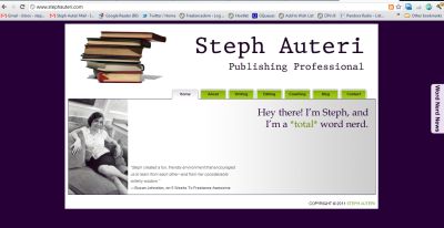
As they may not know your work first-hand at this point, consider how you can make examples of your superior capabilities easily available to those researching your business. For example, on my About page, in addition to giving a quick run-down of my professional experience, I also link to my professional website — where one can find a resume and portfolio. I also use my About page to link to the other blogs I presently contribute to.
Besides a portfolio, positive feedback from previous clients can also reassure web surfers that you’re someone who can be counted on to get the job done. Collect some blurbs and display them prominently alongside your portfolio.
Finally, don’t play hard-to-get.
It’s not cute, and only tests people’s patience. Make it easy for people to contact you, or to follow your work.
Just this morning, I added plugins to Freelancedom that allow readers to easily subscribe to my blog, via either an RSS feed or e-mail. I also included a link to my Twitter account, plus my e-mail address, on my About page.
If people can’t easily figure out how to reach you, they’ll (even more easily) decide that you’re not worth it. Make yourself available to your clients, and make it easy as pie.


Speak Your Mind