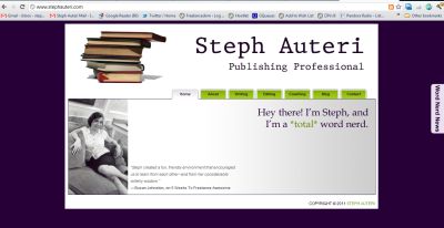
Earlier this year, I blogged about whether or not an editor would judge you if you didn’t have some sort of online platform. (Short answer: Yes.)
Since then, several clients have asked me for help in overhauling their own professional sites.
Which can be difficult. A website is a very personal thing. There’s no one right way to do it. It’s up to you to surf the web and bookmark examples of websites you like, making notes on what works and what doesn’t, and drawing up wish lists of your must-have features.
It’s also up to you to figure out what message you’re trying to convey (unless, of course, you hire a branding consultant).
What I can do is provide freelancers with a handy checklist of the basics they should include on their professional site.
1. A landing page. This is your storefront, the first thing that web surfers, assigning editors, and hiring managers see. Because of this, you need to convey instantly what you’re all about, letting the viewer know that he or she is in the right place. How do you do this? With your header. With your content. And sometimes even with your color scheme (color and pattern can be a great way to convey personality). If you’re not sure what, exactly, you’re looking to convey, ask yourself:
- Who am I targeting with this website?
- What action am I hoping they’ll take?
- What do I have to offer?
- What emotion am I trying to convey?
- What is my life purpose, and how can I present it in an easy, bite-sized, elevator speech-type way?
2. Your contact info. And please, make it obvious. A web user shouldn’t have to conduct an exhaustive search in order to email you. What if they want to give you money for something?? Don’t make them beg. Place the info in the sidebar and, for good measure, have a separate “contact me” page with a contact form. And for something extra impressive, you can register for a Gmail address that features your personal domain name right here (and sometimes through your hosting service).
3. Social media buttons. I’m going to assume you’re active on Twitter. Or LinkedIn. Or something. Because it’s in your best interest to engage in social media in some way. Right? Right. So make it easy for people to find you on those other sites, too. Place social media buttons in your sidebar, perhaps close to your contact info, and throw that info onto your contact page as well.
4. A bio. Your landing page will give viewers a basic idea of what you’re all about. An “about me” page will go deeper. Include a personal bio. A company mission statement. An origin story. People like to buy from people. Help them get to know you.
5. A mailing list opt-in form. It’s always a good idea to cultivate a mailing list, even if you don’t plan on using it right away. In the future, it can act as a publicity tool. A sales tool. A way to survey your readers. A way to disseminate breaking news. That mailing list is power. (You can sign up for mine over in the right-hand sidebar 😉 Mailing list and e-newsletter services like MailChimp, AWeber, and Constant Contact make popping a sign-up form onto your website easy.
6. A list of your services. Let’s return to that question you asked yourself above: What action do you want viewers to take? Do you want clients for your copywriting services? Ghostwriting collaborators? Speaking engagements? No matter how you choose to do it, make sure it’s clear to viewers what they can hire you for.
7. Some sort of portfolio. It’s not enough to tell people what you do. They’re going to want to know if you’re any good. They’re going to want to know if you’re experienced. They’re going to want to know why they should hire you. Portfolios come in all shapes and sizes, but what’s most important is that you showcase your best work, and that you focus on the work that most closely reflects the work you want to be doing more of.
8. An intuitive navigation. As mentioned above, you shouldn’t make people work to give you their money. Make sure you have a clear and simple navigation that immediately makes sense to those surfing your site, and that it repeats on every single page. Viewers should be able to easily get to whatever the hell page they want to, from whatever the hell page they’re on.
9. A blog (optional). This one’s optional, but I’m going to include it on this list because I think it’s a good idea. Why? A blog gives people a reason to (regularly) revisit your site. It establishes you as an expert in whichever topic you choose to blog about. It acts as a standalone portfolio, highlighting your writing ability. It shows editors you can write for the web. And if you’re worried about the time commitment, know that frequency doesn’t matter. Being regular does.
This is a bare bones checklist. What other web-related questions do you have?
Related: Will An Editor Judge You If You Don’t Have an Online Platform?, How To Get Your Guy, and Look Good Doing It


PERFECT timing! Am just contemplating a website do/re-do.